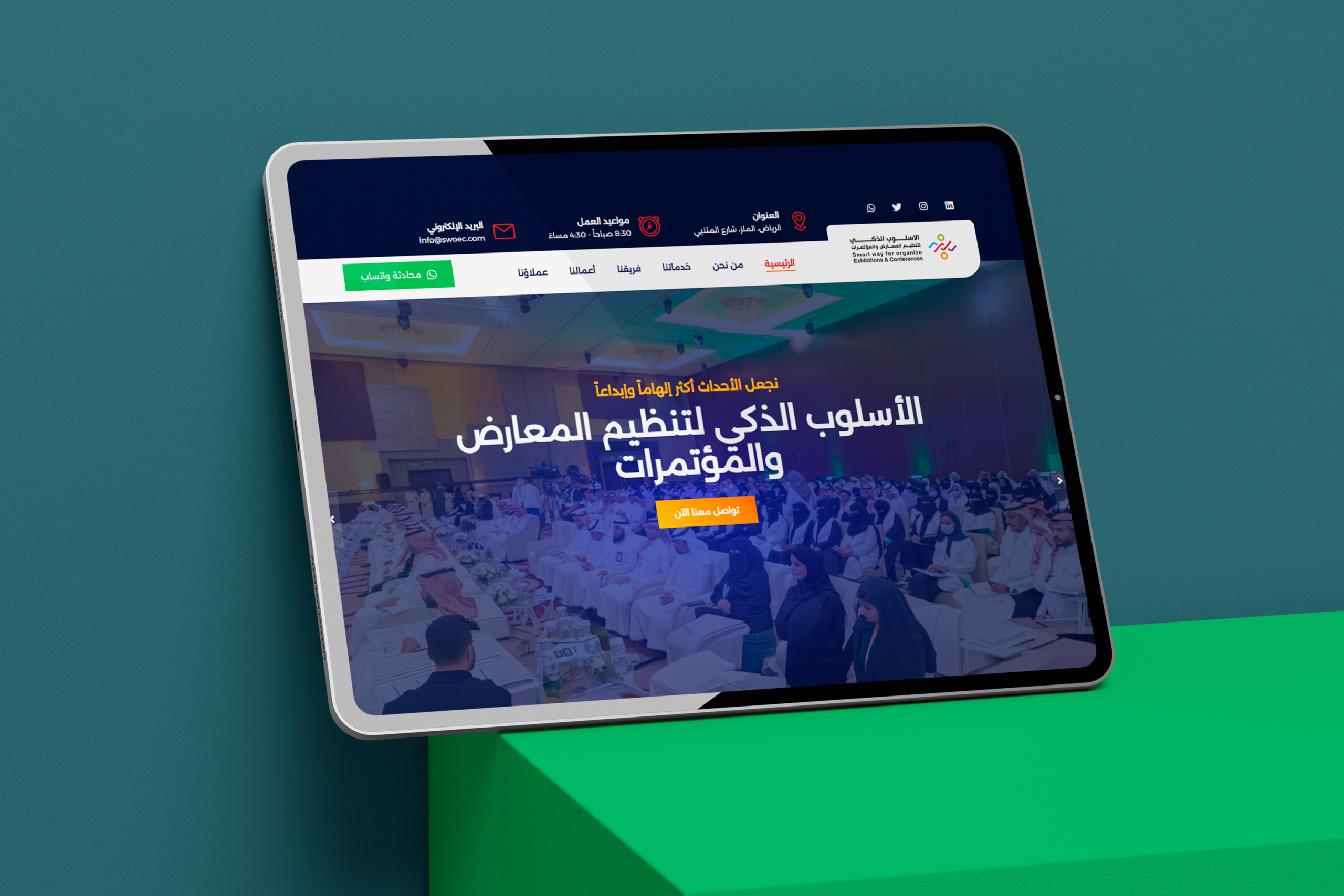
When we were tasked with designing the digital presence for "Smart Way" (SWOEC), we didn't see it as just another website project. We envisioned it as an "interactive art canvas" whose mission was to convey the sense of inspiration and creativity that defines their events. The challenge was clear: how do we translate the vibrant energy of a live conference into a captivating digital experience?
1. Visual Storytelling: A Narrative Told Through Imagery and Color
The Opening Shot (Hero Image):
Instead of using sterile stock photos, we carefully selected a dynamic, panoramic shot from one of their actual events and applied a semi-transparent navy blue color overlay. This technique not only showcased their success but also added a cinematic quality, making the visitor feel like they were part of the moment. The bright white text layered on top appeared like a movie title, evoking a sense of prestige and importance.
Color Palette as a Psychological Tool:
We didn't use color for mere decoration, but for emotional guidance. The deep navy blue created a sense of trust and professionalism, while the vibrant orange, used for the "Contact Us Now" button, acted as a spark of energy—an explicit invitation to take a chance on planning something extraordinary. The green for the "WhatsApp" button was a creative touch, symbolizing availability and giving the "green light" to start an easy, informal conversation.
2. The Art of Motion and Micro-interactions
Dynamic Scrolling:
As users scroll through the site, content doesn't just sit statically. We implemented subtle fade-in effects for headlines and paragraphs. This creates a sense of movement and flow, making the reading experience more engaging, as if the story is unfolding before the visitor's eyes, step by step.
Living Buttons:
On mouse-hover, the buttons didn't just change color. We added a subtle animation, a slight "pulse" or "lift," making the button feel responsive and alive. This adds a layer of interactivity that encourages clicks and engagement.
3. Typography as an Artistic Element
Curated Fonts:
We chose a modern, elegant sans-serif font for the main headlines to reflect the "Smart Way" identity—contemporary and intelligent. For longer paragraphs, we used a more traditional, highly readable font to ensure the information was delivered clearly without causing eye strain. This contrast between the fonts created a beautiful and comfortable visual hierarchy.
The Creative Conclusion:
In the end, what we designed wasn't just a collection of web pages; it was a complete sensory experience. We used every tool in our creative arsenal—from color and motion to typography and imagery—to craft a digital world that accurately reflects the promise of "Smart Way": to turn every event into an unforgettable, inspiring experience, starting from the very first click on their site.